Kerry Dignard Photography Logo design
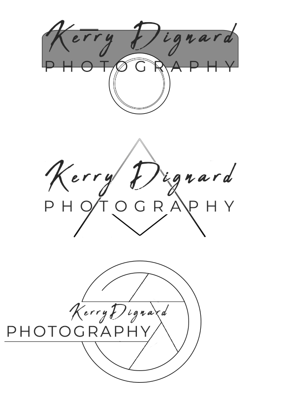
Customer asked for a logo to use for their photography business. Below are the initial direction options I presented them with - these weren't meant to be finished products and are missing design elements like the watermarking.
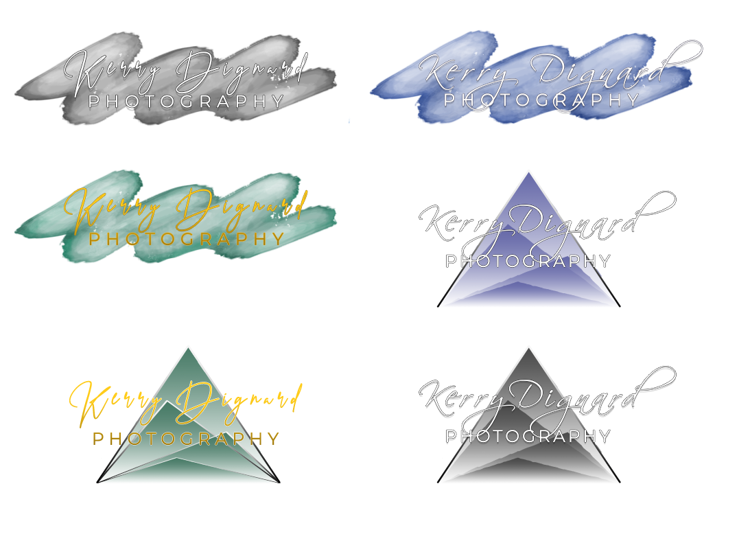
Customer liked the middle triangle direction the most, but also wanted to see some watercolor action and maybe something with mountains. Also font changes.

Customer asked to see some of these in different jewel tones and white font.
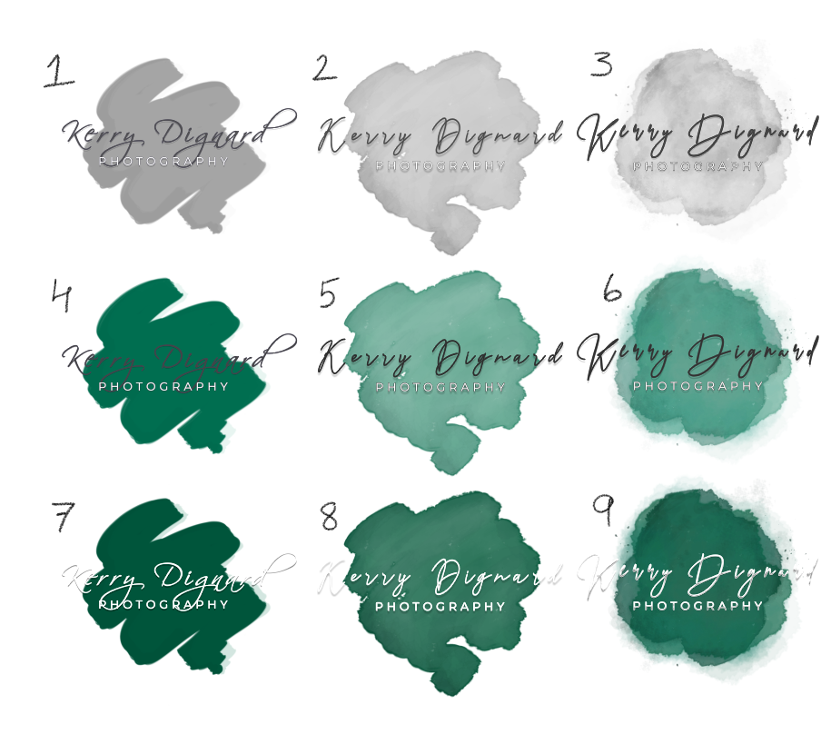
Customer asked for different watercolor variations, focusing on green and gray.
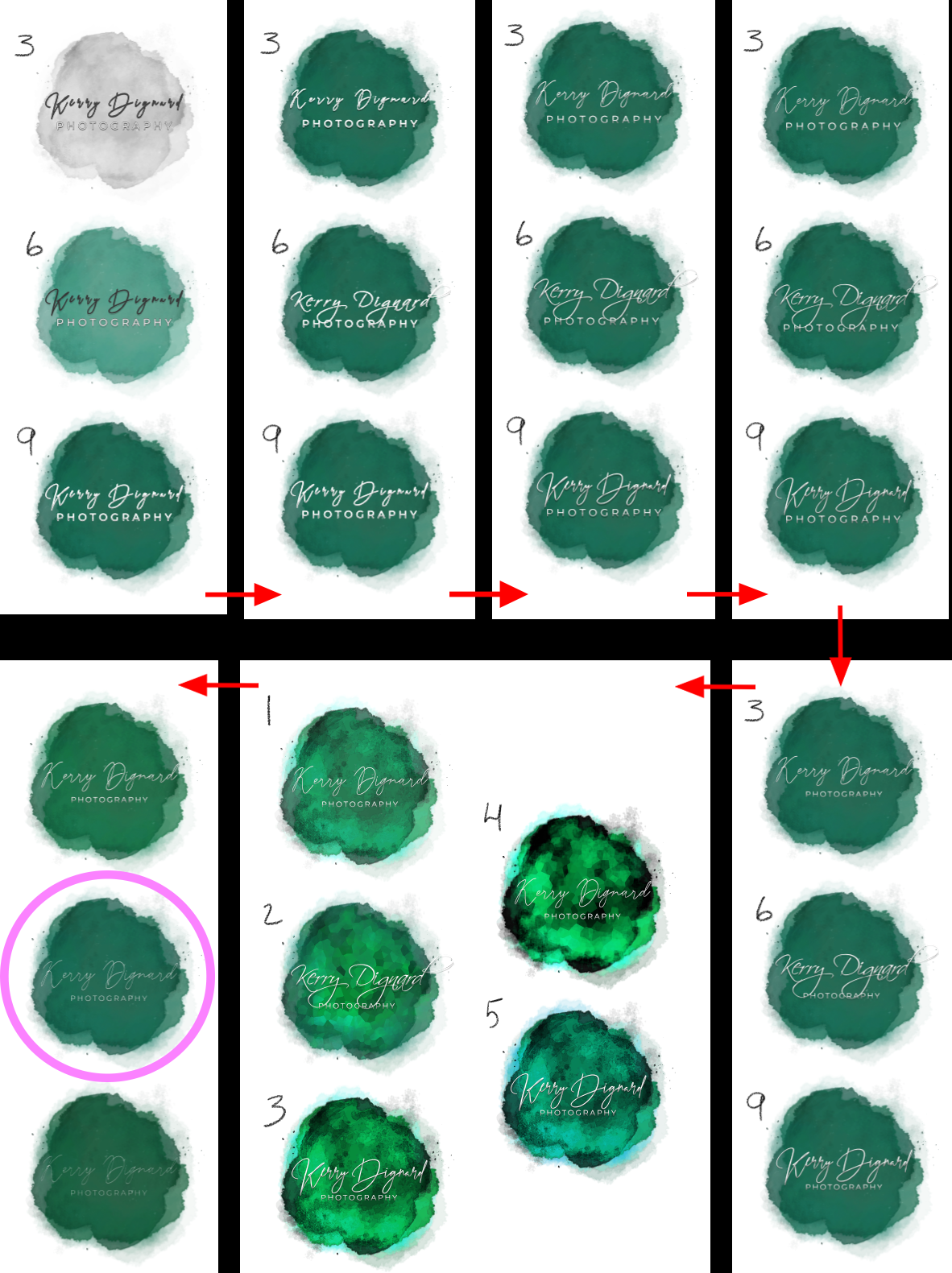
Customer liked the 3-6-9 set on the right the most. We proceeded to go through many different variations in sets of 3. Red arrows show the chronological timeline. Pink circle is the one the customer chose.